Care Chronicle:
Creating Collaborative Care
Healthcare Mobile Application
More than 40% of Americans are affected with chronic disease; of these 38 million suffer from migraines. How might we enable providers and patients to forge collaborative partnerships to better manage chronic conditions?
THE CHALLENGE
Create an integrative medical app that providers and patients can use to collaboratively manage chronic conditions. By treating patients as partners and digitizing symptom tracking and treatment plans, patients will be better educated and have greater ownership of their care, resulting in a better patient experience.
We began by focusing on migraine patients. Our biggest challenge was to make a “migraine-in-progress” friendly design that was flexible and easy to use while including all the necessary components.
THE SOLUTION
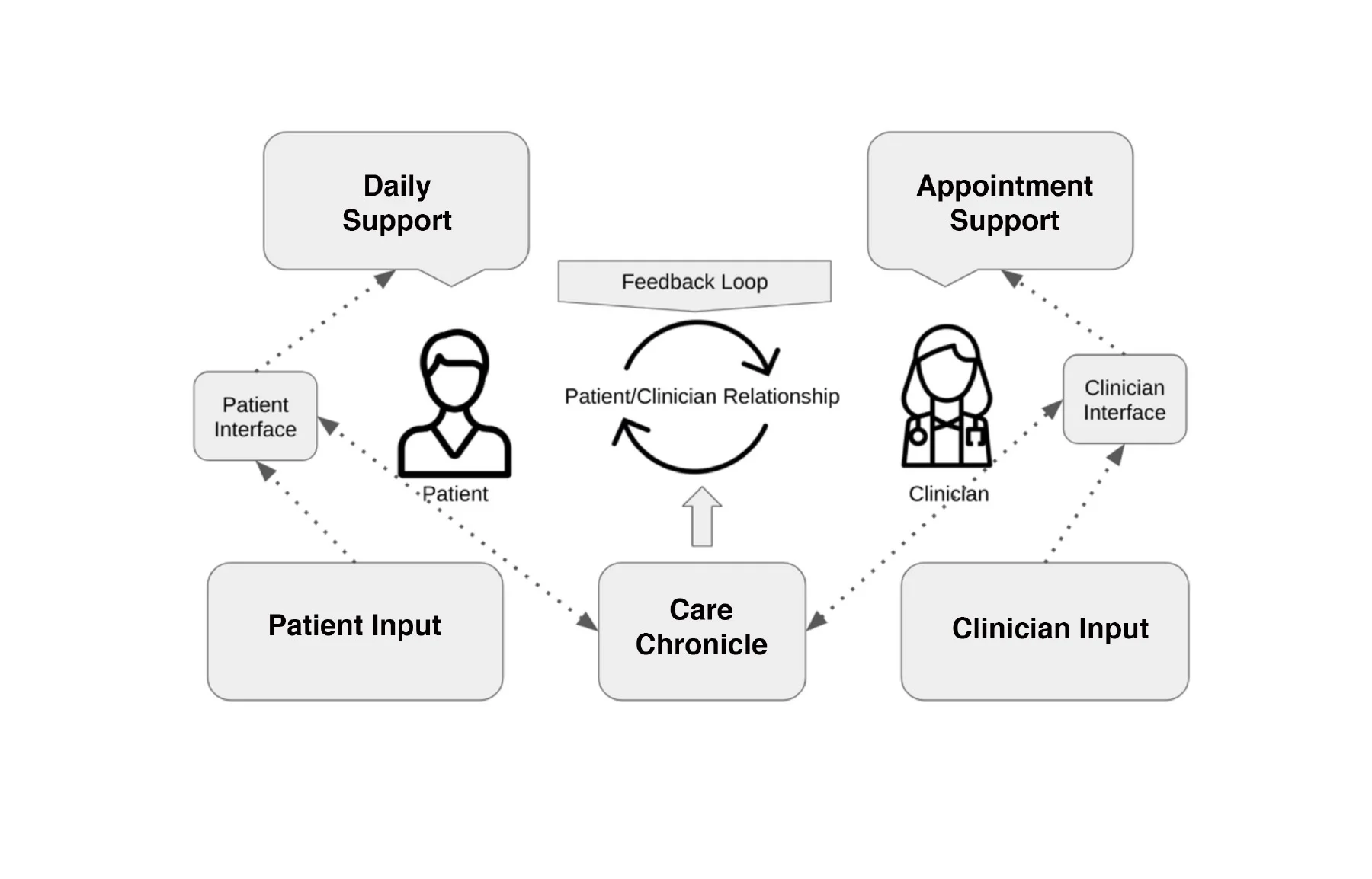
We created Care Chronicle, a native iOS mobile app design for migraine sufferers with an accompanying desktop dashboard for providers. This allows doctors to customize migraine care plans and patients to access their care plans and record their migraines.
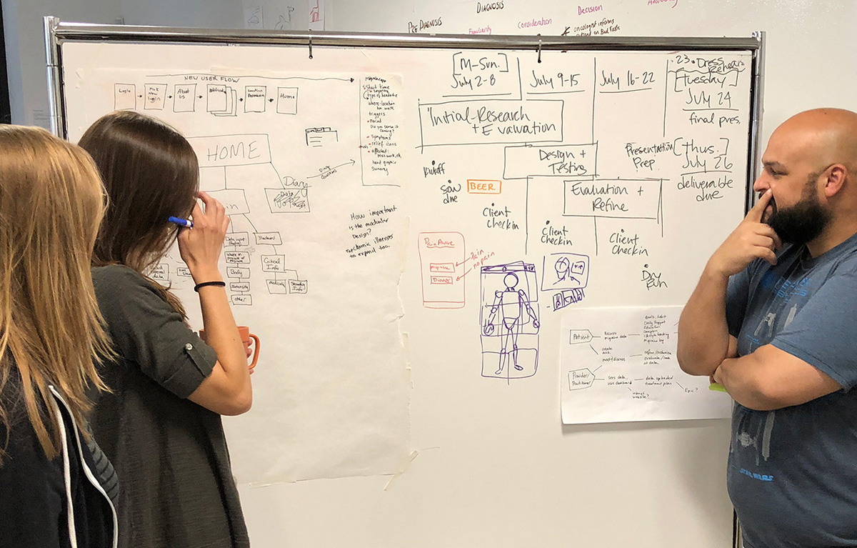
We used human-centered design thinking to gain understanding, empathize and reduce risk. We also used the design sprint, lean UX process to quickly research, ideate, prototype and test our ideas.
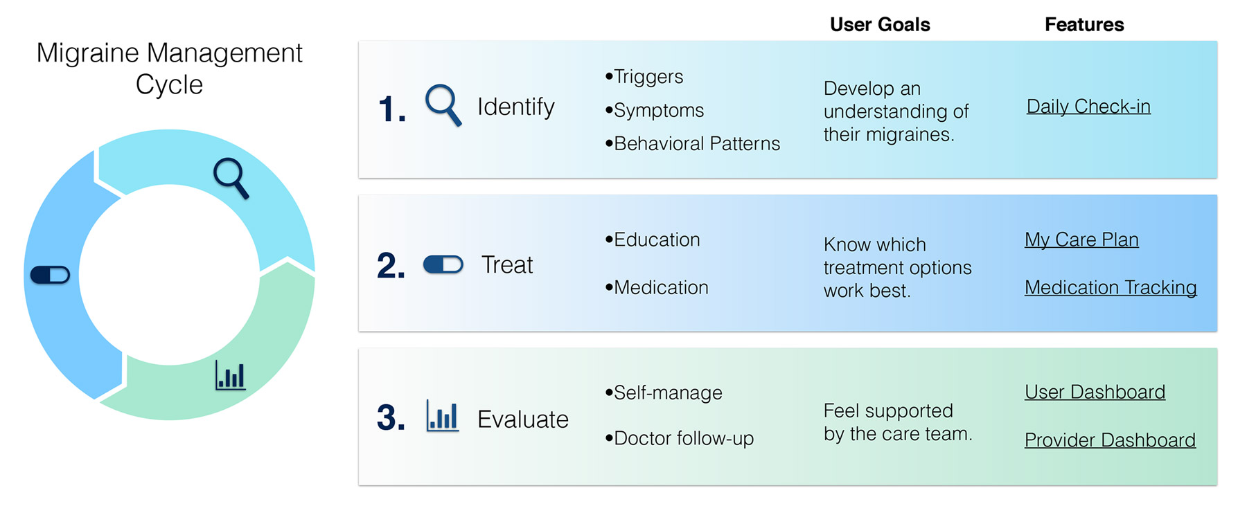
Our research revealed three phases needed for our app to be successful: identify, treat, evaluate. Our design creates a useful feedback loop for patients and doctors. Patients track their daily health habits and record their migraine events. The data is shared with providers. By recording and evaluating this data, doctors and patients can each better understand migraine triggers, patterns, symptom severity, what works and what doesn’t in order to co-create and customize care and treatment plans.
Future iterations would likely take advantage of wearable devices to incorporate health stats and monitoring, in addition to lifestyle and wellness tracking to better manage chronic disease.


My Role
User Research
Analysis & Strategy
UI Design & Prototyping (low & high fidelity)
User Recruitment
Client Liaison
Tools I Used
Whiteboards
Paper, Pen & Pencil
Trello, Realtime Board, Coggle
Sketch App
Axure RP
Adobe Illustrator & Photoshop
Voice Memo & Camera (documentation)
Google Docs, Sheets & Surveys
Keynote
Methods I Used with My Team
Stakeholder Interview
Requirements & Constraints Gathering
Survey for Initial Research
Diary Studies
Competitive Analysis
Interviews & Directed Storytelling
Research Analysis & Synthesis
Mind & Empathy Mapping
Journey Mapping Storyboard (low fidelity)
Rapid Prototyping (low & high fidelity)
Usability Testing (with low & high fidelity screens)
Additional Methods Used by Team
Card Sorting
Personas & Scenarios
Kano Analysis & Survey
Storyboarding (high fidelity pen & ink)
Five UX Designers
We had a team of five: three researchers and strategists, one lead UI designer, one lead illustrator. Though these were our main roles, we all contributed to research, strategy, feature design and screen/flow development.
We all made low-fidelity sketches and wireframes of screens and flows. Four of us worked in Sketch App developing ideas, screens and flows into high-fidelity prototypes. Our lead UI designer created several screens and the final prototype in Axure. Our illustrator created all the high fidelity storyboards and head/body screens.
Timeline
We had just three weeks from the client kickoff meeting to completion.
THE CLIENT
Rowen Berry of HealthPartners - Park Nicollet
This app is intended to be managed and dispensed to patients through HealthPartners. Rowen's goals and vision for the project:
Create a tool to improve how patients and providers collaborate to manage chronic conditions, starting with migraines.
Improve communication between patient and provider
Modular design which can be expanded to other chronic conditions
“This app will improve migraine management by transforming care plan communication via a single provider through an interactive platform for resources, recommendations and personal health data tracking. It is important that this tool be customized to the individual patient and integrated into their healthcare experience and provider relationship.” — Rowen Berry
FOCUS
Migraine apps already exist, but they tend to be overly complicated and not customizable. Our challenge was to create a better solution and user experience by
Personalizing the app, thereby allowing for data management and reducing complexity
Designing flexible interactions to record migraine symptoms in progress or later
Integrating it into the the provider/patient system for iterative customization and treatment plans, thereby also eliminating paper migraine diary tracking.
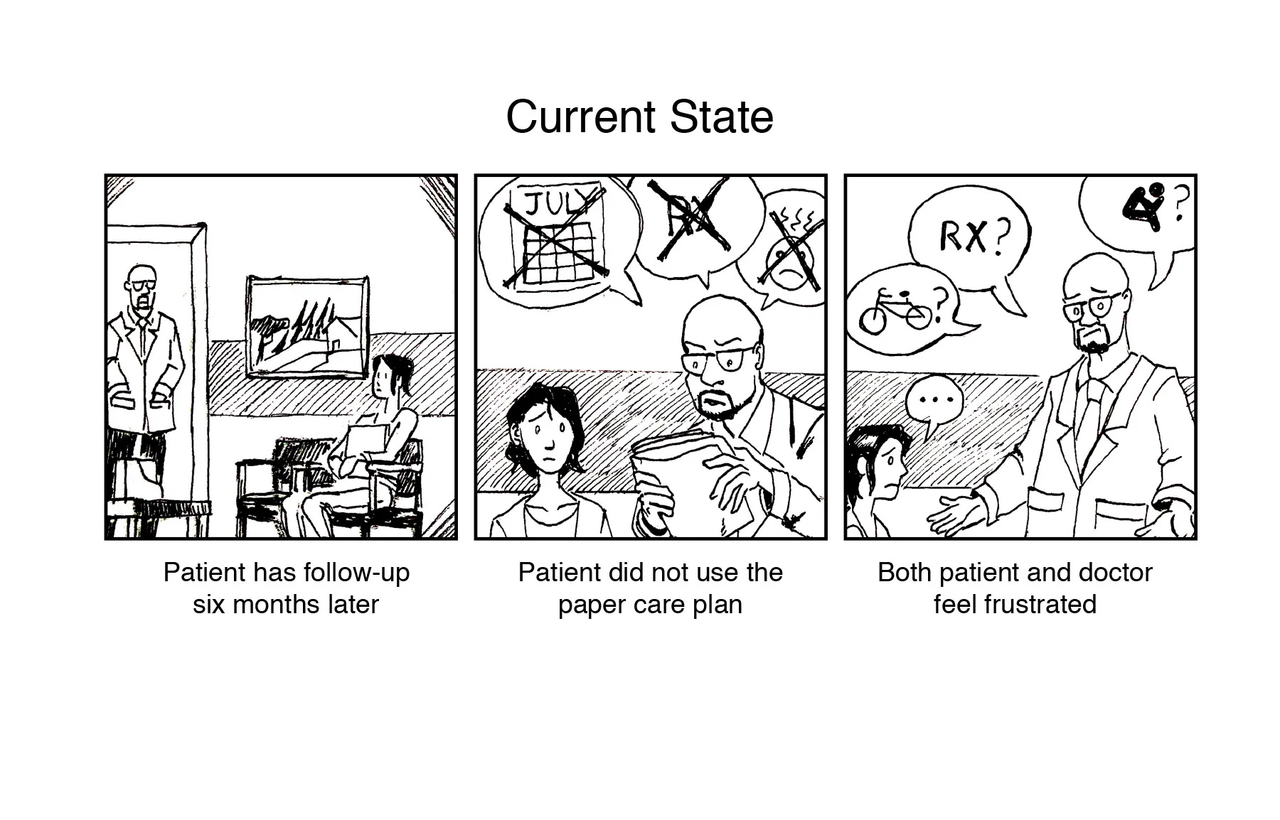
Example of current, paper migraine tracking system.
Currently if a patient is diagnosed with migraines they are given a paper migraine tracking system. The problem is these trackers are often lost, filed away, forgotten or not handy when experiencing a migraine. How many patients would carry their migraine folder and treatment plans with them wherever they go? By digitizing this process, migraine patients can access their treatment plans and record their migraines wherever they are. The data can be shared with doctors to discover patterns and customize treatment plans.
OUR APPROACH
Deep Dive Research and Learning
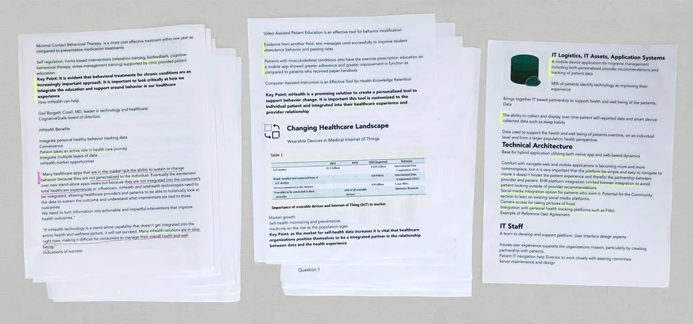
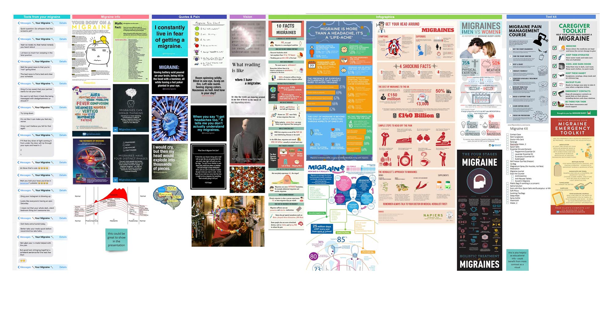
We began with the stakeholder kickoff meeting to identify goals, requirements and constraints. Our client Rowen shared her MindMeister mind map with us, a wealth of information and research, but hard to digest in its sprawled out form. I copied, pasted and roughly formatted her MindMeister mind map into a 32 page document. This made it much easier for our team to read, highlight and refer to throughout our design process.
Client's MindMeister mind map. This image shows about one third of the original mind map.
I copied, pasted and formatted the MindMeister mind map into a 32 page document for ease of use.
Discovery
What is it like to experience a migraine?
What causes a migraine?
Are migraines the same for everyone or are there variations?
How do migraine sufferers manage their migraines?
Can they even use screens (in an app) during a migraine?
Have they discussed their migraines with clinicians or sought treatment?
These were just some of the questions we needed answered.
Migraine Survey and Diary Studies
I developed the initial survey and diary study research protocols and I recruited eight test participants who suffer from migraines on a regular basis. From these we received eight survey responses and seven completed diary studies.
Interviews and Card Sorting
In addition to the survey and diary studies we conducted in-person interviews with four people and card sorting exercises with seven people.
Quotes from some of our research participants regarding their migraines:
I would not be able to use my phone. I cannot look at anything, not even a mirror to look at myself. The pain builds, piercing my brain, it lasts 8-12 hours. I need to lay in complete darkness.
A dark theme app with as few options as possible would be best.
I could use an app (no bright colors) for maybe 30 seconds or so.
I’ve never been able to stop a migraine. One lasted 16 hours. My goal is to cope with the pain, get relaxed and fall asleep.
It feels like an ice-pick jamming in head, dizzy, hard to walk, or focus. The whole migraine lasts 2-3 days.
It feels like my head is slowly being ripped in half. I just want to lay down on the floor and die.
Primary exploratory research included an initial survey, diary study, card sorting and interviews.
Along with analyzing and synthesizing our primary research data with spreadsheets and whiteboards, I created a research / mood board of secondary research using Realtime Board from online content I gathered.
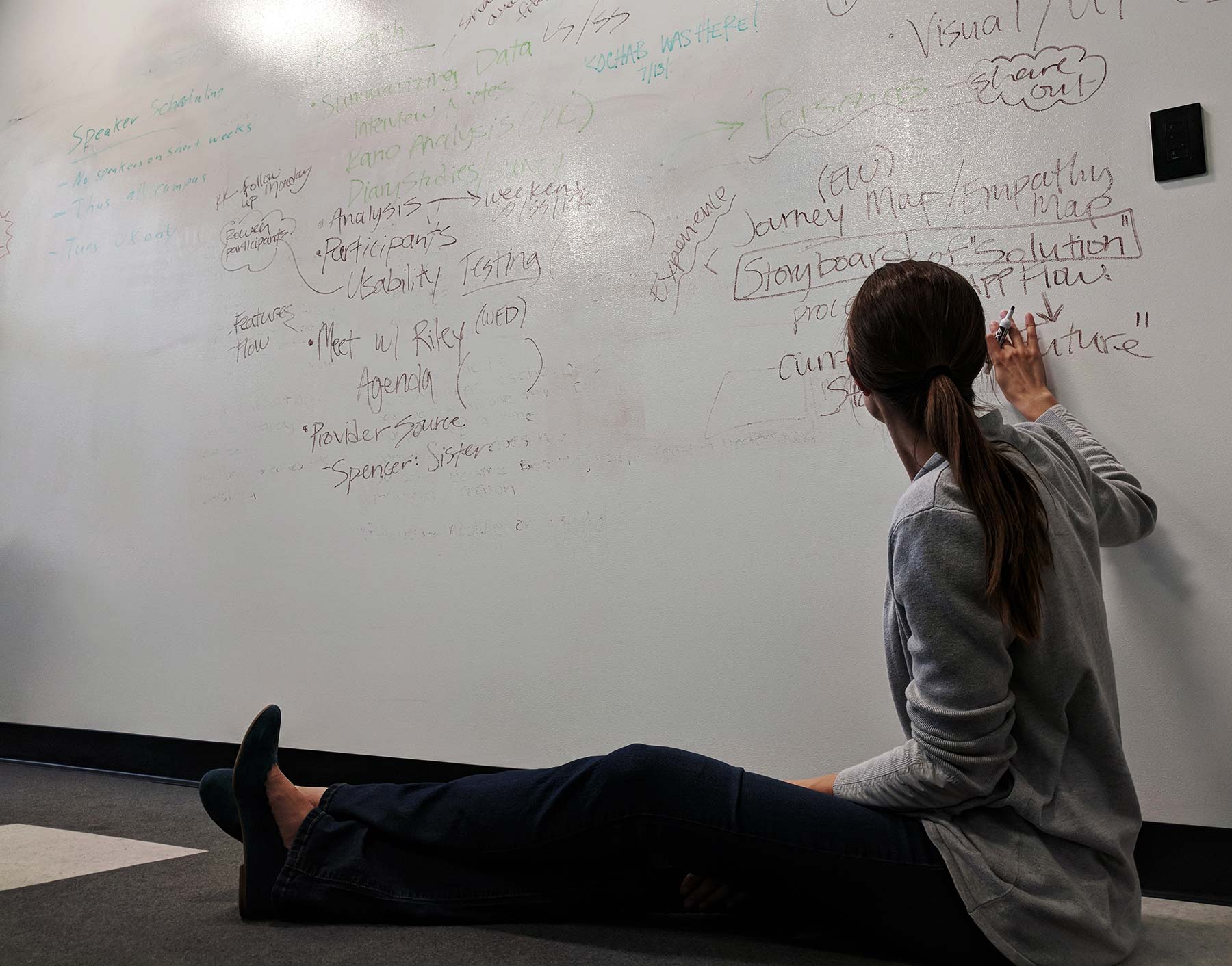
I also created an empathy map and two mind maps using Coggle to further explore, distill and diagram data from our primary and secondary research. These maps helped our team better understand migraines, explore opportunities and create empathy to identify with migraine sufferers.
The mind map has two parts: a mind map of a migraine (left side) and a mind map for the migraine app (right side).
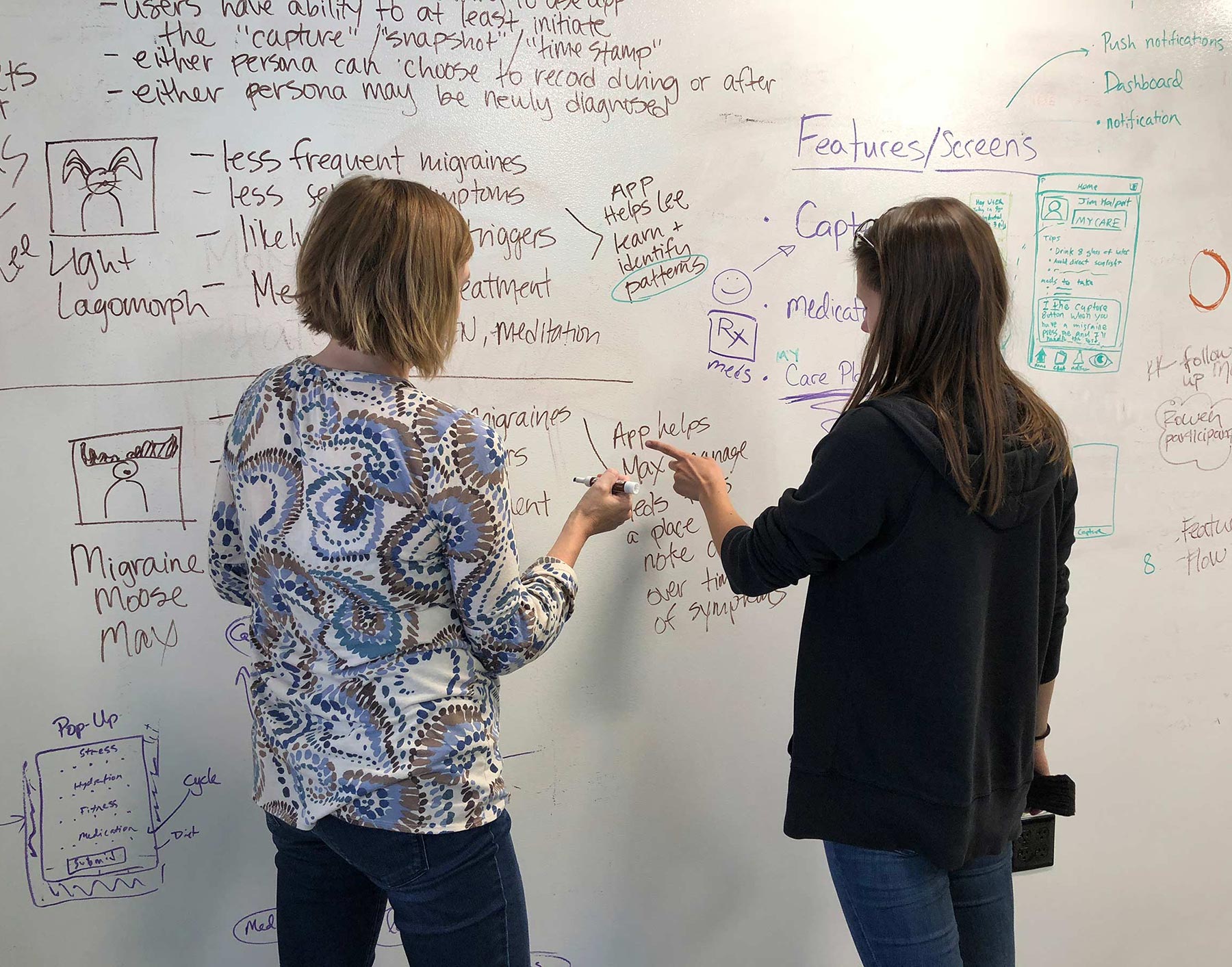
Neither the mind maps nor the empathy map encompassed all our research or ideas, but they served as great jumping off points. We began ideating app features, screens and user flows based on our primary and secondary research findings and competitive analysis of other migraine apps.
Our research uncovered the following:
Migraines can cause visual impairment, intense pain, nausea, confusion and sensitivity to light and sounds.
Our research participants did not want to fuss with screens to enter a lot of data during a migraine. Our app would have to have dark, restful colors with options to record migraine data and symptoms in the moment or later.
Migraine sufferers often do not see migraines as a chronic condition to discus with doctors. Many of our research participants had not discussed their migraines or sought treatment, and just self-managed their migraines.
Migraines can be extremely disruptive and impact quality of life and work. Migraines vary from person to person but also can change over time for any one person.

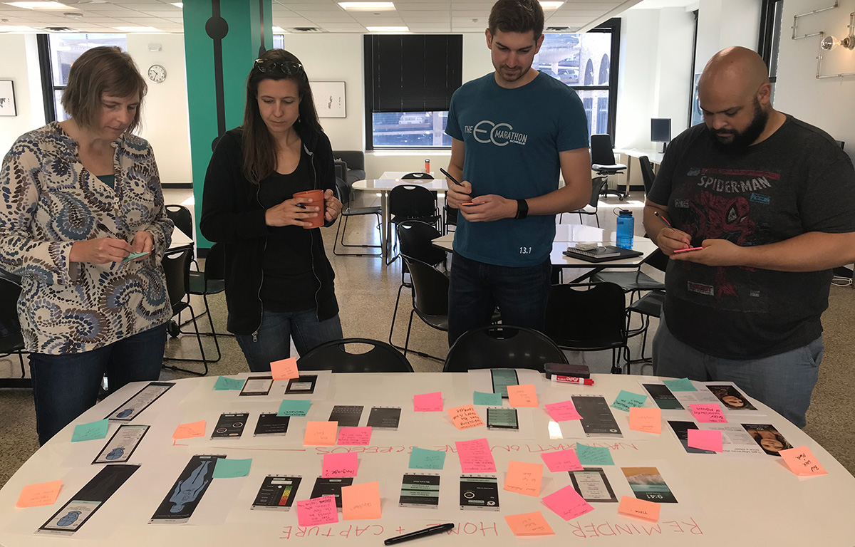
Kano Survey Feature Analysis
We identified key features we thought should be included in the app. We tested 10 of these in a Kano survey to determine each feature’s value.
A few key Kano findings:
People liked the idea of having a capture migraine time stamp with notifications to record symptom data later.
They thought having dashboard data like health, cycle trackers, weather and migraine history would be helpful to identify migraine triggers and patterns.
Syncing with a wearable device, having a comment field, but also preventing push notifications would also be helpful.
Below: first two photos show two Kano features with participants’ comments. The next two show the survey results of all 10 features.
User Flow Design Challenges
One of the most difficult parts of the whole process was designing the home screen, wording and user flow options for the Capture Migraine screens, Survival Guide and Care Plan. We sketched and prototyped many versions. Each of us had our own opinion of the “Capture Migraine” flow.
Which would create a better user experience for someone experiencing a migraine?
Two main buttons? – Capture Migraine (migraine-in-progress now, start time/date stamp) and Enter Data (migraine is over or subsided, user can record symptoms).
One main button? – Capture Migraine (migraine-in-progress now, start time/date stamp).
We also explored syntax and word pairs like Have/Has, Start/End, Capture/Enter, In Progress/Past, Now/Later. We voted and chose a few pairs to test with users, along with one or two buttons. The results were inconclusive and we were running out of time.
Additionally, none of our research participants experienced a migraine during our project so we were not able to test the app while someone experienced a migraine. We had to trust past recollections of our research participants and our imagination to ascertain what it would be like to use the app during a migraine.
By talking through our ideas, examining scenarios, sketching storyboard journey maps, holding critiques with our team and other UX designers, conducting A/B testing and interviewing users, we were finally able to land on the final flow version which is a one button home screen: “Capture Migraine”. But it took several days, many iterations and was by far the most difficult step in the design process.
Exploring ideas for the Capture Migraine flow with two main buttons.
More Capture Migraine flow ideas and architecture.
Personas, Journey Maps, Storyboards and Scenarios
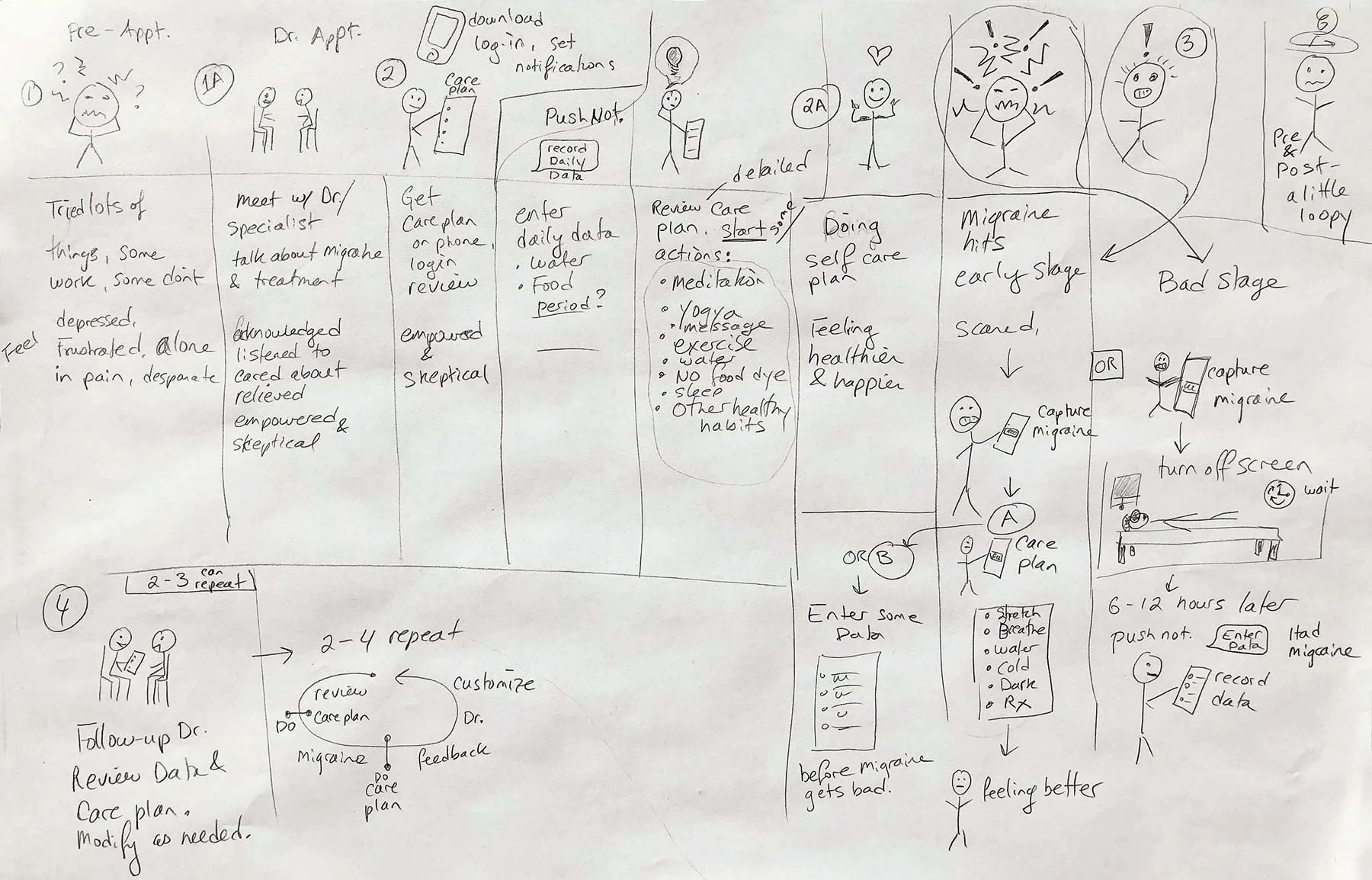
Based on our research we created two personas. I created and sketched two low-fidelity storyboards exploring the migraine patient’s journey. Along with the personas, these journey maps helped us assess scenarios, features and user flow. I handed them off to our team illustrator to build upon and develop into high quality pen and ink storyboards.
Below are the final pen and ink storyboards. The top row of pen and ink drawings illustrate a migraine in progress with the current provider-patient relationship of migraine care.
The bottom row depicts an improved provider-patient relationship experience and migraine care plan solution using our app. (Pen and ink storyboards by Phil Howe.)
User Flow Design
I created and designed the “Migraine Survival Guide” and “My Care Plan” flow and screens. According to our hypothesis and research it was important that the “Capture Migraine” flow included these options:
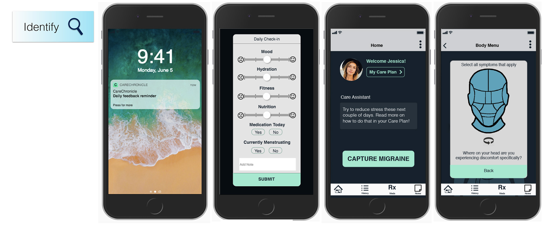
Record My Symptoms – if the user was not visually impaired or under duress, they could begin to record their symptoms and other relevant data.
I’d Like to Rest – if the user was under duress, they could just time-stamp the migraine and receive a notification to record data at a later time.
Migraine Survival Guide – if the user needed to know the best way to treat their migraine (this info would be customized to treat their migraines).
My Care Plan – this flow helps the user learn and practice habits to understand prevent migraines and watch for and avoid triggers (this would be customized to treat their migraines).
Above: Sketching and exploring ideas, content and flow for the My Care Plan and Migraine Survival Guide screens.
Below: Final high fidelity screens and partial flow for Capture Migraine sequence, Migraine Survival Guide and My Care Plan.
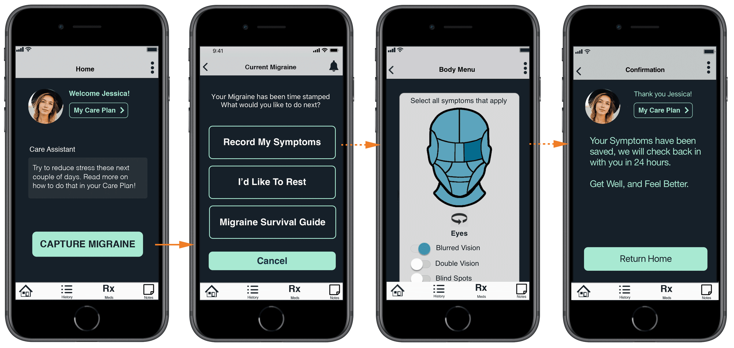


We developed high fidelity wireframes using Sketch App and created a prototype with Axure RP. We conducted five usability tests with migraine sufferers.
We continued to evaluate, iterate and refine our design and flows based on the feedback.
Our Axure prototype and Sketch files have some design inconsistencies due to multiple people working and contributing design iterations before a style guide could be finalized. It is still very much a prototype.


KEY TAKEAWAYS
Migraines
Migraines are a poorly understood neurological condition that can include vascular and/or muscular pain. They are often undiagnosed and under treated. Migraines have many triggers such as weather, stress, sleep, hormones, diet and imbalances in serotonin.
Migraines can include visual impairment such as vertigo, blurry vision and seeing colors and patterns that shouldn’t be there. They can produce intense throbbing pain, nausea, sensitivity to light, sound, smells and last anywhere from 4 to 72 hours. “They are not just headaches, they are life-aches.”
Key Components and Differentiators
Identify | Treat | Evaluate
Care Chronicle is designed to be dispensed through a provider. The provider sets up the account and the patient downloads the app. Doctors and patients can co-create and customize treatment plans.
Since migraine symptoms can include intense pain and visual impairment, we designed our app to be flexible; to easily record migraine triggers and symptoms in the moment or at a later time. This creates a positive user experience and motivation to use the app.
The app captures and time stamps a migraine event. In the future it would capture data from wearable devices.
The app allows users to easily record migraine triggers, symptoms, history and other information which is stored and accessed through the dashboard. Data is also shared with the provider and is essential for collaborative, proactive, preventative care and migraine management.
REFLECTION
With three weeks to complete the research, synthesis, app design and delivery, we were not able to accomplish all we had hoped for. We would have liked to have done more design iterations, evaluation, testing and UI refinement. Nonetheless we are proud to have achieved as much as we did in the short time we worked on this project.
Addressing chronic pain and learning about migraines was a profound and humbling experience. Creating research protocols and conducting interviews required a deep level of trust, empathy and sensitivity as our research participants openly revealed their pain and suffering to us.
One of the most difficult parts was designing the user flow to include different options — imagining how someone with a “migraine-in-progress” would want to use the app.
We had also hoped to explore branding more. One of our team members came up with our app’s name, “Care Chronicle” and I designed a quick logo. We chose green because it is restful to the eyes. Dark backgrounds are more soothing than white backgrounds if someone experiencing a migraine and sensitivity to light.
We had a well-defined objective, a strong team and are grateful to our research participants for their time and contribution.
Our team: Phil Howe, Laurie Sugiarto, Spencer Sterling, Kristin Krueger, Rowen Berry (client), and Erika Weldon.


